Wednesday, August 3, 2011

The Long & Short of it

I'm joining the crew over at CAS-ual Fridays
again this week. They have been hosting the best
and most unique challenges. This month's challenge,
The Long & Short of it
was to create a tall, skinny card (or a short, fat
card depending how you go about it!). I can honestly
say that I've never even thought to create a card
with these dimensions...not sure what that says about
my creative genius (or obvious lack thereof!) Ha!
Anyways, enough chit chat. Here's what I came up with:

Crazy, eh? Who would've thunk?
I'm super happy about the way it turned out.
I think the tallness of the card just stretches
the happy factor to epic proportions :)

Here's a little close-up of the flower:
I knew I wanted something a little extra-
special because of all the white space (well,
green space, if you're going to be technical)
of the card and I think the embroidered
flower adds just the perfect amount of snazzy.

I'm loving these challenges and seeing what all
the girls come up with. Lots of crazy inspiration!
Thanks for stopping by :)

The Nitty-Gritty Details:
Paper: Kiwi Kiss, Melon Mambo, Whisper White (SU!)
Ink: Kiwi Kiss, Rich Razzleberry (SU!)
Stamps: flower (Material Girl - CC & Unity), sentiment (Unity - April KOM),
lazy daisy stitch stamp (Messy stitches - Autumn Leaves)
Other: white embossing powder, embroidery floss, sewing machine

Saturday, July 23, 2011

Christmas in July?

This month's HCCC was a doozy! I was totally stumped on this
challengebecause it was so out-of-the-box. I mean, really,
a colour combination of orange, yellow and green for a
Christmas card? I sat down a couple times pulling cardstock
and looking at stamp sets hoping something would come
to me, but each time I was completely stumped.
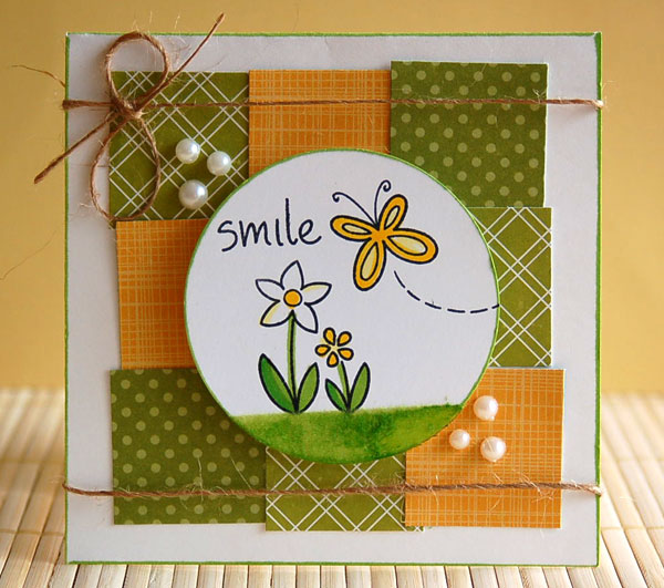
That is until I made this card.
As I typed the words "I have a feeling more of these
patchwork-y cards
will be in my future...
so much fun mixing patterns and colours!
" I finally had
my 'Aha!' moment and here's what I created:
I pulled some patterned papers - a Cosmo Cricket Holly Jolly,
Basic Grey Nook and Pantry and Basic Grey Sugar Rush
(I thought the flowers looked kind of poinsettia-ish)
- and just followed the same layout as the previous
card I had made. And, while I'm happy with how it ended up...
...I'm pretty sure these won't be our Christmas cards this year :)

So good to be pushed out of my comfort zone though.
Thanks for getting us to think out-of-the-box, Marnie, and
creating what may have been the most challenging challenge yet!

I'm going to have to think up something epic for August...

Sunday, July 17, 2011

A Wedding Card

I'd recently seen a challenge about creating a card that coordinates the the theme colours of a wedding. So when we received an invite for a wedding this past weekend, I thought it would be fun to make their card with their wedding colours. The only problem was their colours were black and yellow. How does one create an elegant wedding card using black and bright yellow? Without the card looking like a bumblebee? I was quite stumped, until I saw this card.
I figured if I could find some cute patterned paper, I could put together a little patchwork that would be fun, but still classy enough for the wedding. Next problem was, I only had one sheet of patterned paper that was yellow, none that were black...and that's when the inspiration hit me and all of a sudden I knew this was gonna be a great card. Using some background stamps I created my own patterned paper and came up with this lovely:

A little close-up of the flower:
I'm SO happy with how it turned out! Bright and fun, like the bride
and groom, but not too cutesy that it's not appropriate for a wedding.

I have a feeling more of these patchwork-y cards will be in my future...
so much fun mixing patterns and colours!

Thanks for visiting :)

Supplies:
Stamps: Wishing You (Verve), Musical notes (Unity), Text (Hero Arts)
Paper: Doily Print (Basic Grey), Basic Black, Whisper White, Daffodil Delight (SU!)
Ink: Basic Black, Daffodil Delight (SU!), Old Paper Distress Ink (Ranger)
Other: Clear embossing powder (HA), flower die (SU!), twine (PTI), button (BG)

Wednesday, July 6, 2011

A Perfect Challenge!

I came across a new challenge blog this week and it was the
perfect inspiration I needed for a special card.

Our friend lives in a city apartment with his Airedale Terrier
and made the difficult decision to give him a new home
where he can run and play outside all day. I can't imagine
how hard that choice was...and how lonely his apartment
will be without his best furry friend. We're all going to miss
him so much! I wanted to send him a card to let him know
we're thinking of him during this tough time and that we
will always cherish the special visits we shared with him.
So, without further amounts of sob story, here's the card:

This week's challenge was 'Krafts-men':
a clean and simple card for a guy, using kraft cardstock.
I started with a kraft base which I embossed with
a Tim Holtz impression plate. I rubbed distress ink
all over the impression plate before I ran it through
my Cuttlebug and it gave it a great weathered look.
Another layer of kraft with a torn piece of Riding
Hood Red cardstock to border it and then wrapped
it in twine and frayed the edges. I finished the panel
with four brushed copper eyelets.


To finish it, I stamped a retired SU! sentiment on Very Vanilla
cardstock with Riding Hood Red ink and heat embossed it
with clear embossing powder. I love the way it makes the
words really stand out. Lastly, I heavily distressed all the
edges and adhered it with some pop-dots.

I'm so happy with the way it turned out! I wasn't sure
what kind of card to create for the situation, but hopefully
this will send a special warm-fuzzy to our friend...
in a very manly way, of course!

Thanks, CAS-ual Fridays for the inspiration!

Wednesday, June 29, 2011

For the boys

Between Grandpa and Dad's birthdays and Father's
Day, I had a whole bunch of man cards to make.
I wasn't feeling particularly inspired at the time
so I used layouts from some other manly "man
cards" to get my mojo flowing.

The first card was for Grandpa's birthday. I used
the gift bag on page 62 of the May/June PaperCrafts
to start me off and this is what I camp up with:
I used some old SU! papers from my stash
and a sentiment from Verve. My trusty
Spellbinders dies for the label shape and this
card came together licky-tee-split!
Love it!! And I think this is such a versatile
sketch to work with. I can totally see making
this in fun, bright colours for a child's birthday.

Next up were some Father's Day cards and
Dad's birthday card. Both of these cards were
inspired by ones in the SU! Summer Mini
catalogue, just switched up the stamps and
papers and a few little details.


I especially love how this card turned out!!

It was fun tying in lots of details and textures without
getting overly frilly or bling-y.

After making these cards, I feel a lot more excited about
creating cards for guys. I was glad for the inspiration
I could use to, not only make the whole process a lot
quicker, but to learn some great techniques for 'dressing
up' cards for the men in my life :)
And a special thanks to this gal for lending me SU!'s
Countryside stamp set. I would've never got this set on
my own, but I've used it SO much in the past few weeks,
I just might have to add it to my "Buy Immediately" list :)
It's a crazy versatile set and I'm finding I'm using it for
everything. Thanks, Marn!

Tuesday, June 28, 2011

June's HCCC

Just a quick post to share this month's challenge
card. It turned out a lot different than I had envisioned
in my head...but I think that's okay
because I really like it!

My 'borrowed' item was the plastic from this tomato
container. I used it to cut out some butterflies with my
Cuttlebug - I love how they turned out and will
definitely be doing this again. I saw a package of
die cut 'ghost shapes' (clear plastic hearts) at the
scrapbook store for $5.99. My tomatoes cost
$2.99, with the added bonus of getting tomatoes :)
Making your own embellishments is a huge
money saver! Plus, reusing the container is
environmentally friendly and feels like I'm
giving myself a good, Dutch, pat on my back. Ha!

Originally, I thought I would use the layout
from the inspiration card. I really liked it
and it was so different from what I normally
do...but it just couldn't get it, so instead
I used the colours from the card: Baha Blue,
Kiwi Kiss, Rose Red, Pink Pirouette and used a
layout from a card I saw online a long time ago.
I copied the sketch, but forget where it's from.
I can't take credit for it, and my apologies to the
original creator!

I used Versamark to stamp the polkadot background (Unity)
and Basic Grey patterned papers for the little butterflies.
The sentiment (Inkadinkado) was heat embossed in white.

Overall, a sweet, happy little card...
that puts a smile on my face!
:)

Loving these Hazzard County Card challenges!
Can't wait to see what you've got in store for
us in July, Marnie!

Sunday, June 19, 2011

The Biggest Form of Flattery?

It was our uncle's birthday and I was in a total crunch for
a quick card that would suit him. Thankfully, my friend
came to the rescue and let me borrow the perfect stamp
set...and the perfect card to create with it :)
Using this amazing card for my 'inspiration'
...okay, okay, I totally copied it! Just changed up the
cardstock and patterned paper with what I had on
hand ...
I think I put this together in like 10 minutes:

An absolutely perfect card for our uncle who is
restoring a '78 Chevy.
Happy Birthday, Uncle Garry!!

And thanks, Marnie, for coming to the rescue again! :)